OUR WORK
This is just a tiny selection of our most recent work.
It spans digital, OOH, press, events, film & photography and so much more.
Enjoy.
-
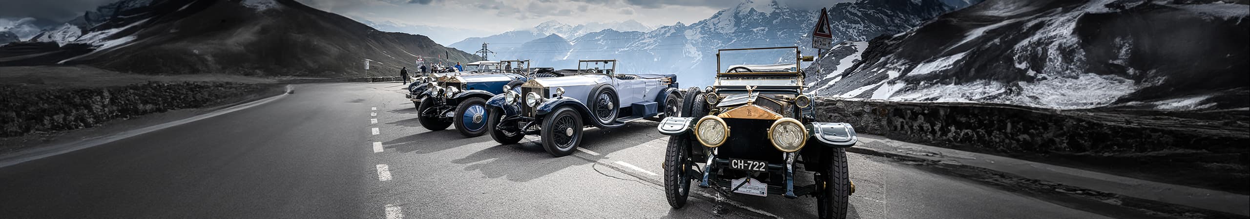
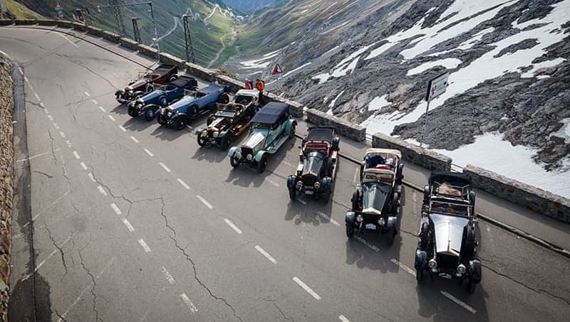
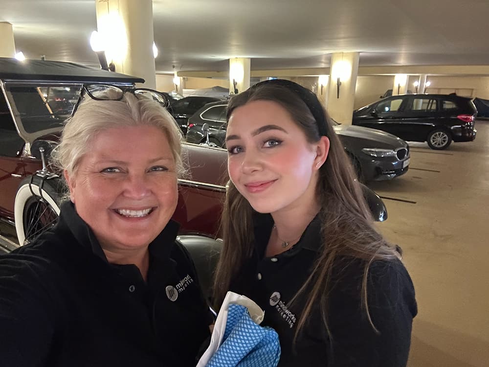
20-Ghost Club
2023 Alpine Tour
- Event Planning
- Design & Print
- Photography
- Film
BRIEF
We were invited by the 20-Ghost Club to be the event organisers of their 110th Anniversary Tour to celebrate the legendary Alpenfahrt trial. The oldest Rolls-Royce car club in the world are rightfully proud of being custodians of these wonderful cars and delight in actually using them on the road retracing many of the routes of period competitions and trials and celebrating key events in Rolls-Royce history and heritage. The Alpenfahrt was a circular endurance race, beginning and ending in Vienna and tackling the challenging Alpine passes of several European countries. It was the 1913 trial which put Rolls-Royce on the map as the ‘best car in the world’ and re-enactments in modern times have even included some of the original cars which perform just as well now as they did over 100 years ago!
ACTION
MindWorks started planning the 2023 anniversary event 18 months in advance and were responsible for every aspect from mapping the exact route to booking each of the 10 hotels as well as everything in between! One of the most enjoyable aspects was organising two group excursions – one to see the opera at the world-famous opera festival in Verona – and another enjoying a boat trip on beautiful Lake Garda. But the most rewarding and indeed, inspiring element of the event was seeing over 30 gleaming pre-war Rolls-Royce motor cars driving in convoy just as effortlessly as the day they were created.
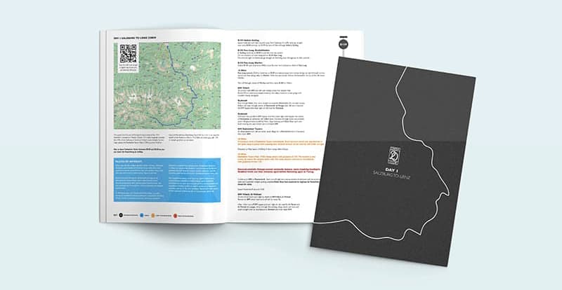
RESULTS
The 2023 anniversary tour was two and a half weeks of thoroughly enjoyable motoring through Austria, into the Italian Alps, down to Lake Garda and Venice and then along the Italian riviera to the coastal towns of Porterož in Slovenia and Opatija in Croatia. The final leg then turned in-land again and went back through Austria and Slovenia to its final destination in Salzburg. And we went with it to ensure the smooth running of this prestigious event. What an incredible experience which we are delighted to say our guests also thoroughly enjoyed: “…thank you both so much for all your input that has made the 2023 Alpine such an outstanding success for myself and my family. Everyone enjoyed it immensely.”
We’re also delighted to share that it won Highly Commended in the ‘Club of the Year’ category at the Historic Motoring Awards 2023 presented by Octane Magazine.
-
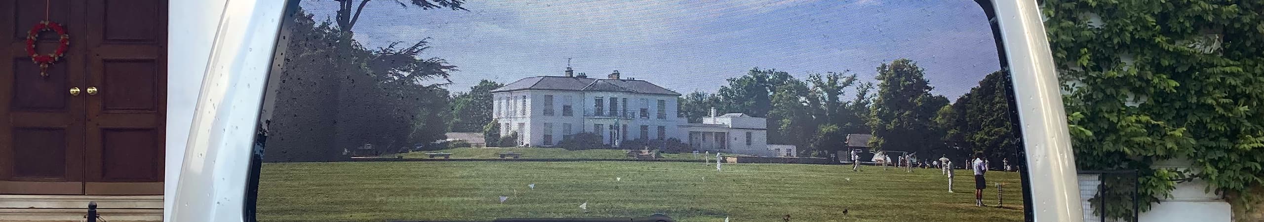
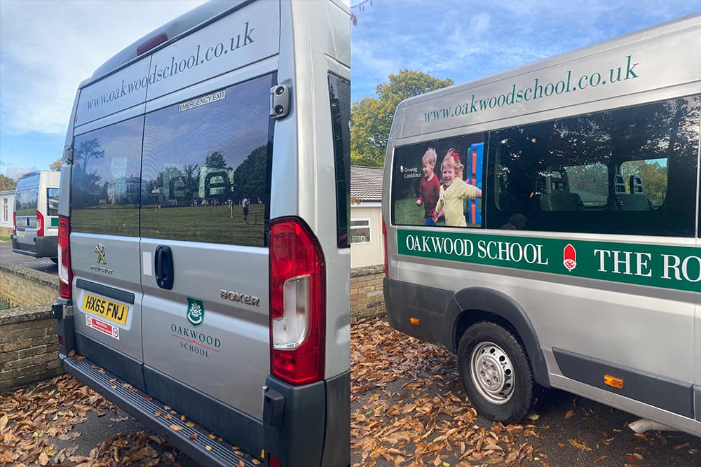
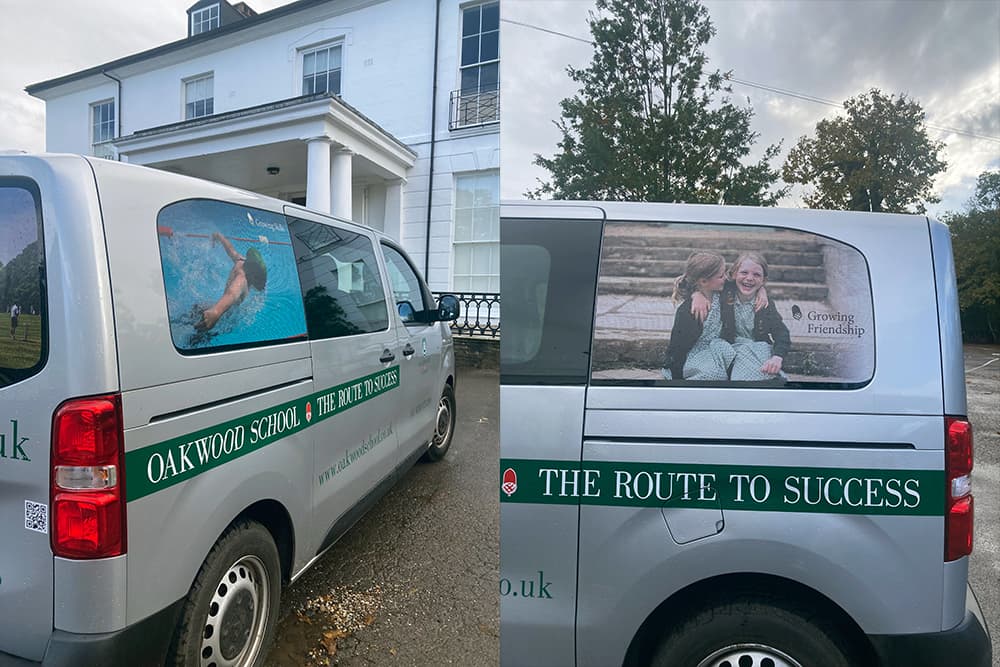
Oakwood School
Vehicle Livery
- Creative Concepts
- Design & Artwork
- Printing
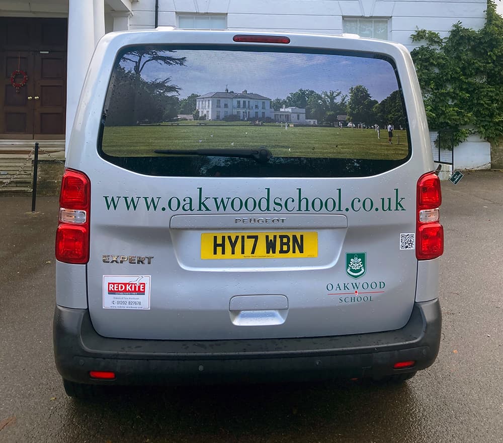
BRIEF
Our client, Oakwood School in West Sussex, wanted to enhance the visual appeal of their four existing minibuses, comprising two Peugeot Expert Diesel 9-seaters and two Peugeot Box 17-seater minibuses. The primary goal was to create attractive and consistent branding as the minibuses play an important role in promoting Oakwood while travelling around the West Sussex countryside. By revamping the appearance of the minibuses they would also better align with the school’s image and values. The lease for these vehicles is set to expire in a couple of years at which time the school will consider moving to electric minibuses. So the design needed to be adaptable to accommodate this, while maintaining Oakwood’s strong visual identity. The specific requirements included refreshing the logo on the bonnet, designing two side rear contra vision panels, implementing a full contra vision panel across the rear of each vehicle using one image across the rear windows, and updating the sign writing and logos on the rear and sides of each minibus.
ACTION
Our design team collaborated with the School to understand the desired aesthetic and developed modern, attractive design concepts that represented Oakwood’s strong values and ethos. The sign writing and logos were refreshed, while one cohesive image was applied across the rear windows. Thorough quality checks were carried out to ensure that the installed graphics met the design specifications and durability requirements.
RESULTS
The refreshed graphics have significantly improved the overall look and appeal of the minibuses. Using cohesive and consistent branding across all four minibuses reinforces the School’s identity, actively promoting Oakwood’s image and values while on the move. The design’s adaptability also allows for any future transition to electric minibuses when the lease expires.
-
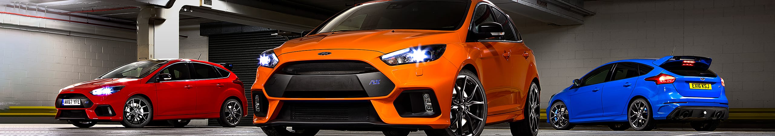
Ford
Photography network
- Resource Management
- Film
- Photography
- Retouching

BRIEF
Ford is the country’s biggest car brand, and prioritises stand-out PR in their marketing approach. It has always been important to Ford that the images of their cars are of exceptional quality, but before working with MindWorks, they were using a variety of ad hoc photographers with no real structure, making attaining this high standard difficult at times. On recommendation, MindWorks were approached by Ford to take forward the responsibility for all Ford GB photography sourcing across the UK. Our brief was to source and organise a national network of stills photographers available at short notice to provide high-quality original photography for all aspects of the Ford GB brand, including people, facilities, cars, 4x4s and commercial vehicles, whilst remaining cost effective.
ACTION
Using our existing portfolio, not only were we able to establish a UK network of photographers, but also end-to-end production coordination, location finding and retouching. We realised that as we already had a network of photographers and a staff member with a brand-new Ford Fiesta, we could easily demonstrate the quality of our offer with some test shots, before asking Ford to commit. Ford liked the images so much that they ended up using the photography immediately after the Fiesta was named Car of the Year by What Car.
RESULTS
In the last four years, we’ve captured in excess of 24,000 images for Ford. From Land’s End to the North of Scotland; we’ve catered for all of Ford GB’s PR photography needs. The photographers in the network are vastly experienced and have worked for nearly every car brand in the UK, not merely in PR but in advertising as well. This has meant we’ve been able to consistently deliver excellent images to Ford. No matter what part of the photographic or content generation process, we take the problems away.
Images
captured24,000
Customer
satisfaction100%
Successful
shoots100%
-
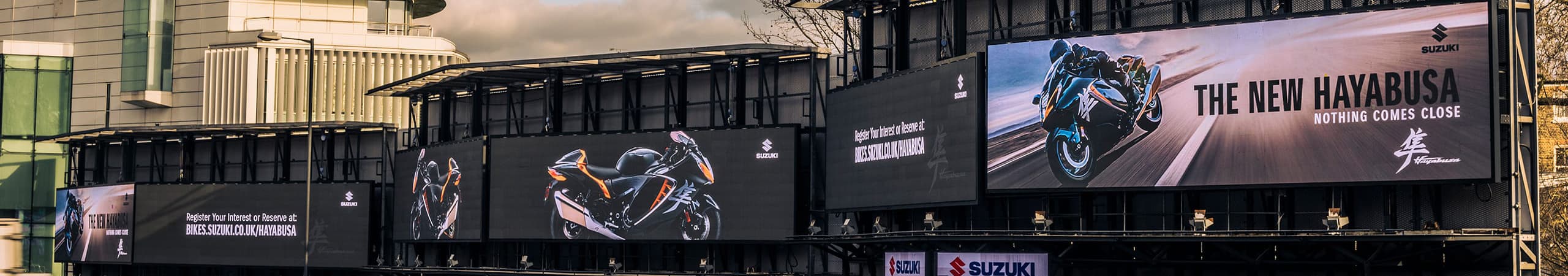
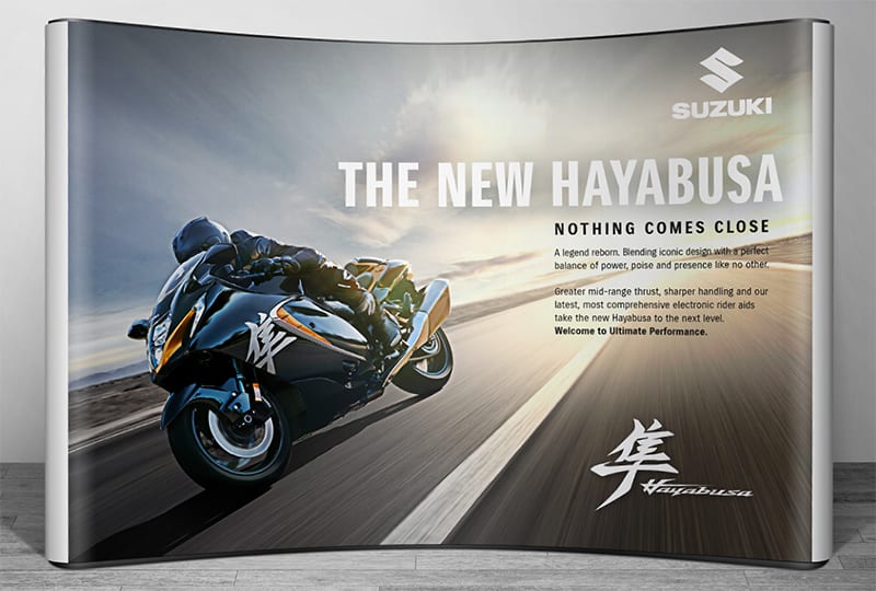
Suzuki
Hayabusa launch
- Digital Advertising
- Press
- OOH
- Point Of Sale
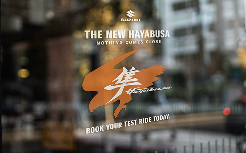
BRIEF
To lead the creative campaign launch for the third iteration of the Hayabusa, Suzuki’s fastest, coolest, most advanced and most iconic of their motorcycles, built with the capacity to go over 200mph with 1300cc and the aerodynamic excellence of a bullet train. We were briefed to target dedicated motorcycle riders – a demographic who really know their technology – and showcase this impressive motorcycle within the industry, demonstrating that Suzuki’s strengthened reputation was here to stay after a series of class-leading model launches.
ACTION
We knew the key to success would be positioning. Focusing on this, we created the core idea and strapline, ‘Nothing comes close’, with a campaign built around the concept of the Hayabusa’s technology, performance, style and reputation going far beyond industry competitors. We also knew that our media solution had to match this idea, so we used the UK’s biggest outdoor media site and saw our poster design spread across a full 72 metres alongside the A4 one of the main arterial routes into central London. Alongside this, we placed the model in full-page ads in the leading motorcycle publication, produced printed assets and a full suite of digital materials including a technical ‘walk round’ film that we wrote, shot, and edited.
RESULTS
Results: Dealer take up was incredibly strong and orders grew over the launch period. The strapline was picked up by the press and used in road-test reports. The model’s sales success story continues.
Exposure
6.7M
Duration
14 Days
Scale
96 Sheets
-
Royal Navy
Recruitment marketing
- App Development
- Film
- Digital
BRIEF
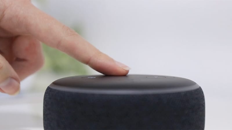
Over 15 years of our highly successful recruitment work with the Royal Navy, we’ve prided ourselves on keeping them at the cutting edge of marketing, whether this be through a unique submariner campaign using lenticular technology, or consecutive years of award-winning recruitment ads. Our latest work to maintain their position ahead of the curve in recruitment marketing used Alexa technology, with particular focus on recruiting strong talent for officer candidates.
ACTION
Now more than ever, recruitment marketing must be brought to the candidates, rather than being something they need to seek out. Looking for new ways for prospective recruits to access key information with less effort, we came up with a unique idea: what if we could bring this information into the homes of the applicants, quickly and easily? In a campaign unlike anything done before, we used Alexa technology to create a system where potential candidates can ask direct questions to their Alexa and be provided with accurate answers to help them along their recruitment journey. Our campaign was accessible, effective and able to provide valuable, relevant information that’s unique to each individual candidate.
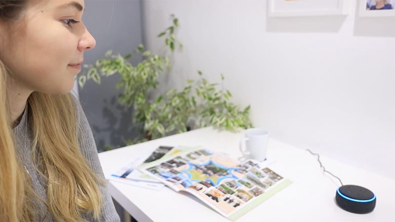
RESULTS
Using Alexa technology to create a hands-free recruitment campaign kept the Royal Navy leading the way in recruitment marketing. What’s more, it ensured ease of information gathering, a positive change in people choosing to consider the Royal Navy as a career and a technology-leading solution that is reflective of this technologically-advanced Armed Force.
Utterances
179%
Customers
409%
Sessions
370%
-
Cardinal Newman Catholic School
Website Health Check
- SEO
- Accessibility
- Website Performance

BRIEF
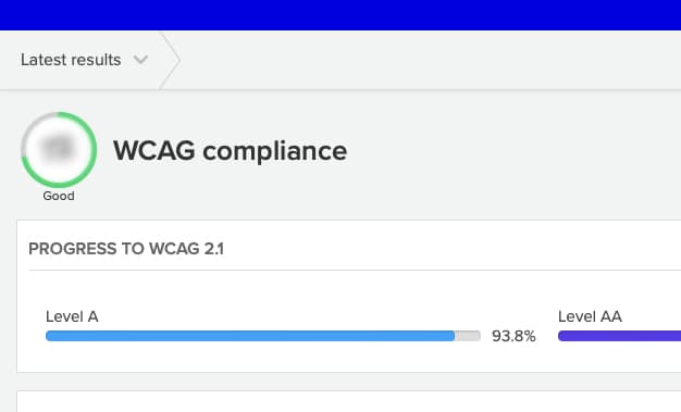
We were delighted when Cardinal Newman Catholic School took us up on our offer of a free website health check by responding to our Cookie Campaign earlier in the year. The website health check is a bespoke MindWorks’ service which we offer to schools and is completely free of charge. Designed to help schools ensure that their websites remain fully compliant, the suite of 16 services range from GDPR & Cookies to SEO and website accessibility.
ACTION
We ran a report on the school’s website by dialling in remotely with no disruption to the school and no risk to the site. By scanning the entire site we were able to gain key insights with regard to how the site was performing. The areas of interest included how easy the site is to access by people with disabilities; how it performed with regards to search engine ranking and whether the content was meaningful and accurate with no broken links, grammatical errors, unlabelled images and other website no nos. The report can be turned around in just a couple of days and is a critical tool to ensure that your website is attracting not just the right target audience but that it is also engaging and easy to use.
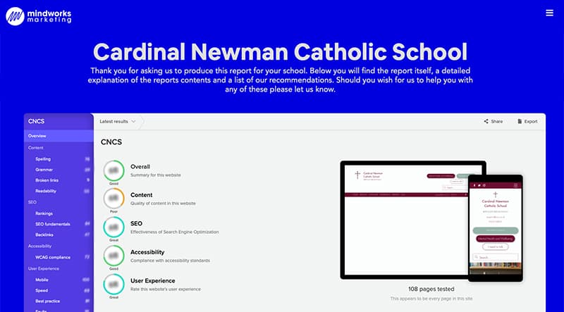
RESULTS
Lily Glynn, the school’s Marketing & Engagement Manager, commented on receiving her free report: “Amazing, thanks Hannah. Some interesting insights there!! Really appreciate the support from MindWorks!” The next steps are to work with the school and we have already been in touch to support them with implementing several key findings from the report.
-
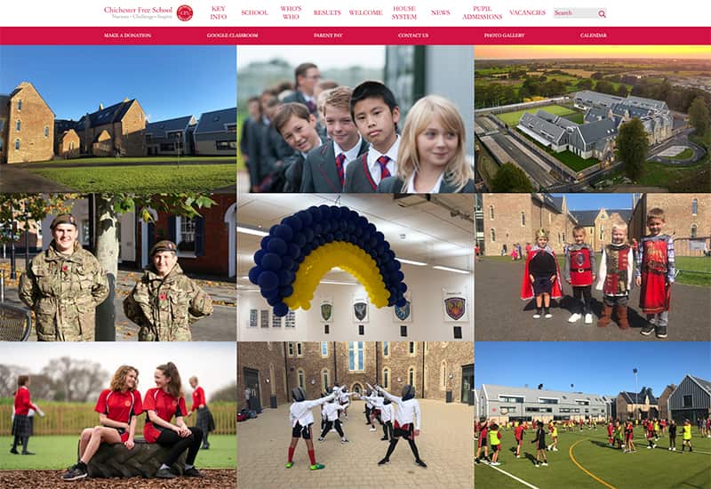
Chichester Free School
Website
- Web Design
- Web Development
- User Experience
- Content Production
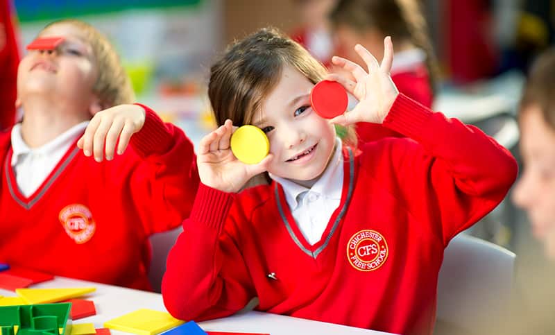
BRIEF
To create a user-friendly and engaging website that is easy to administer in-house. Chichester Free School is an all-through school, so the website had to give equal prominence to all phases, showcasing the vibrant life enjoyed by pupils and the school’s nurturing, inspiring ethos. As well as being secure and robust, with passworded access for different areas, the website would have the ability to pull live social media feeds such as Twitter through onto the site, with pop-up messaging to display the latest news, including results.
ACTION
We designed a 9-grid tile system, with all tiles based on back-end data analytics that reflected the school’s nine most visited pages. Picture-led, with regular photoshoots and updates, each page has a function, such as news with drop down menu of weekly bulletins and school magazine, so users do not have to trawl through all the navigation. One of the most used functions is uploading school letters straight onto the calendar so that parents can easily access them for trips and other activities.
We host the website and provide an ongoing maintenance programme. We also undertake an annual review, updating content where necessary and to ensure compliance with regulations.

RESULTS
Chichester Free School Marketing & Admissions Manager, Karie Wright, commented: “We are delighted with our website - feedback from governors, staff and parents has been so positive. It reflects exactly how we want our school to be portrayed, thank you! It has been an absolute pleasure to work with your team and I would highly recommend you to other schools.”
-
Oakwood School
Magazine
- Design
- Artwork
- Image Manipulation
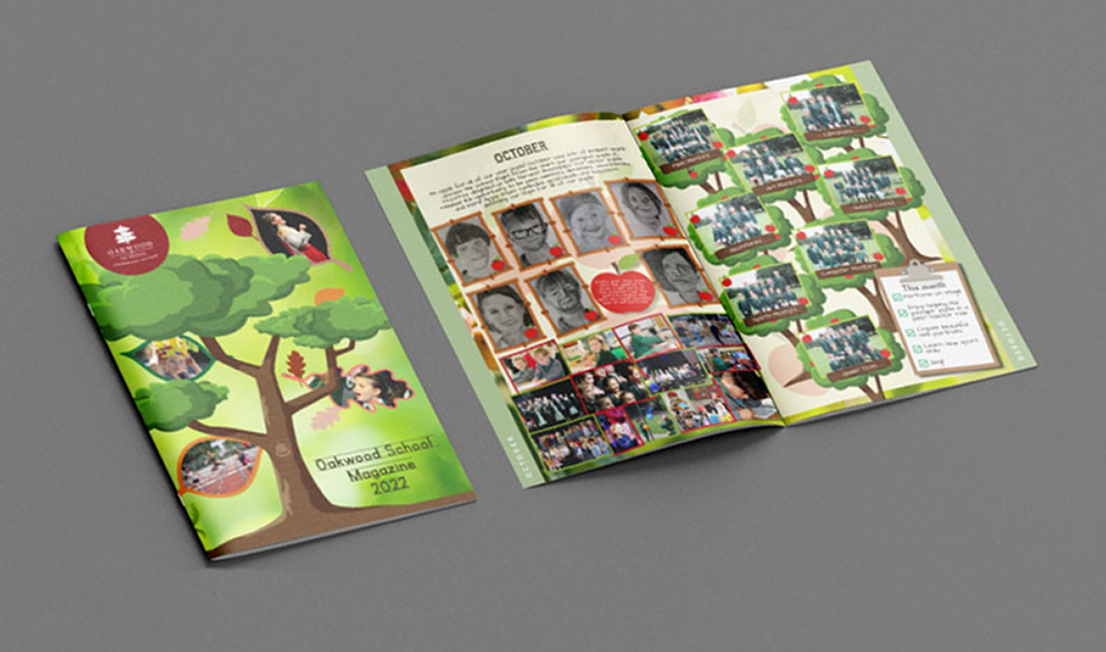
BRIEF
Oakwood School produces an annual magazine that is distributed at the end of the school year to parents, pupils, staff and prospective parents. Designed to showcase and promote the wealth of opportunities offered by the School, the magazine provides an overview of the academic year, with an insight into all the activities and events that have taken place.
ACTION
We have designed Oakwood’s magazine for the past 22 years. Originally a 28-page showcase for pupils’ academic work, it has evolved in style and design to become a 50-page window onto all aspects of life at Oakwood. In keeping with the importance placed on sustainability by the School, the magazine is printed on sustainable forest paper.
While the magazine always contains features such as the Headteacher’s introduction, details of residential trips, sporting events, speech day and images of all the pupils at Oakwood, there is also an annual theme. In 2022, our theme was ‘Our Surroundings’, with each page dedicated to Oakwood’s wonderful outdoor environment, from forest play, to discovering the woodlands and grounds. In 2021, the ‘Bubbles’ theme reflected how, after working in bubbles for much of the year due to Covid, those bubbles were now bursting into life. For 2023, the theme is the human body, portraying the rounded experience pupils enjoy at the school, such as the head, legs and eyes depicting academic life, sports and arts respectively.

RESULTS
The magazine has received many glowing testimonials from parents over the years, and has become a highly effective marketing tool for the School. Issued free to current pupils’ parents, it is also given to prospective parents at open mornings and during school tours, making it a valuable addition to Oakwood’s digital prospectus.
-
Subsea Craft
Product launch
- Events
- Animation
- Photography
- CGI

BRIEF
SubSea Craft is a British privately owned Advanced Maritime Technology company specialising in covert operations within the defence market. We were briefed to lead the creation of their brand identity, corporate identity and product name in order to bring their company to the next level, as well as assisting with the launch of their £1 million core product, a unique high-speed craft, at pre-eminent global industry show, DSEI.
ACTION
Using research and their existing branding as a starting point, we developed the brand and the name of their £11m craft, VICTA, and created physical and digital collateral to use both at DSEI and beyond. SubSea Craft were not able to display the actual VICTA craft at the show, which presented a problem: how do we launch a product that isn’t there, in a 15-metre square space? Our solution was to create an interactive solution that allowed users to explore the craft using augmented reality.
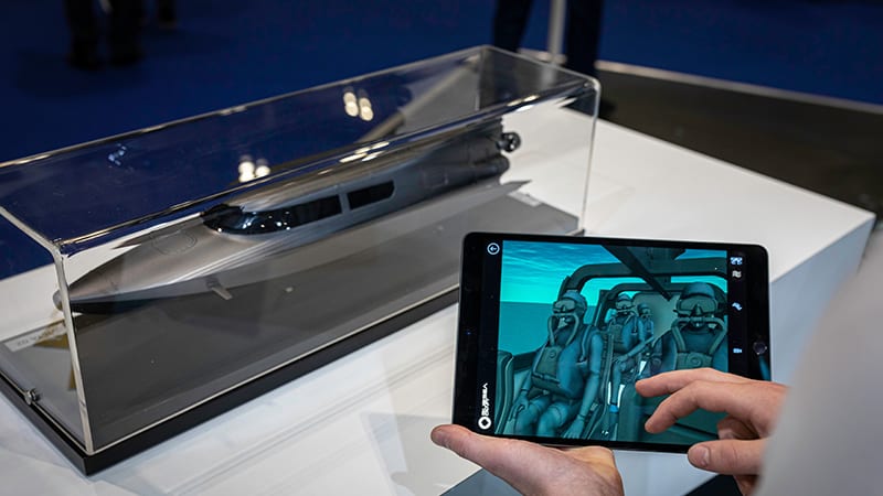
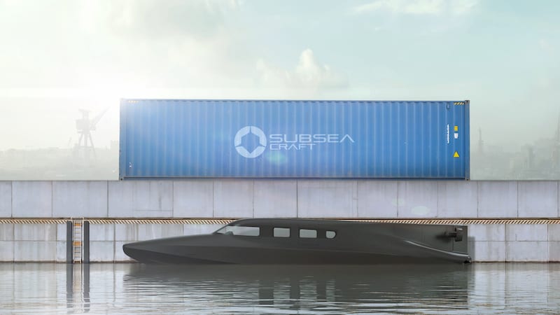
RESULTS
The launch drove the largest peak in traffic to the website to date. Within the first month following the launch, that figure climbed to 7,772 page views and remained high for six months, with 4,749 organic search sessions performed. SubSea Craft currently have 40 crafts on the order book and counting, and are established as world leaders within the industry.
Launch
sales£440M
Site
traffic7750+
DSEI
Attendance78,660+
-
TexEnergy
Brand Identity
- Packaging
- Web Development
- Film
- Photography

BRIEF
Texenergy is a portable infinite off-grid power and energy company, designing and producing the hugely successful portable power products for customers ranging from adventurers and photographers to the military, aid workers and medics responding to disasters and emergencies. Our brief was to complete the branding for the company to confirm Texenergy as a leader in the industry and to support in bringing a revolutionary new portable wind turbine product to market quickly and competitively.
ACTION
We worked with Texenergy to create a brand identity which would reinforce the premium and technical nature of the products, and inspire their diverse client base. Once the brand was established, we created packaging for the first portable wind turbine alongside user guides and a sales brochure aimed at exciting distributors and end customers. This process included everything from copywriting and design to photography, video and illustrations, resulting in a full set of marketing collateral.
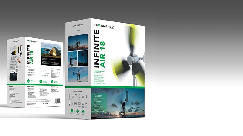
RESULTS
Following the successful launch of Texenergy’s brand and first product, MindWorks has worked with Texenergy consistently, providing ongoing marketing support for all their needs, including packaging, brochures, photography and video to support further product launches and exhibitions.
Texenergy is now an international brand with distribution channels across the world, including into Singapore, Nepal and Cambodia. Texenergy currently has multiple products in their portfolio, and MindWorks has played a leading part in bringing each of them to market.
Packaging
Developed5
Brochures
Designed8
-
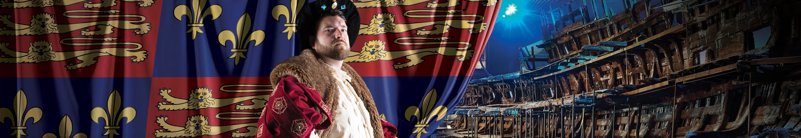
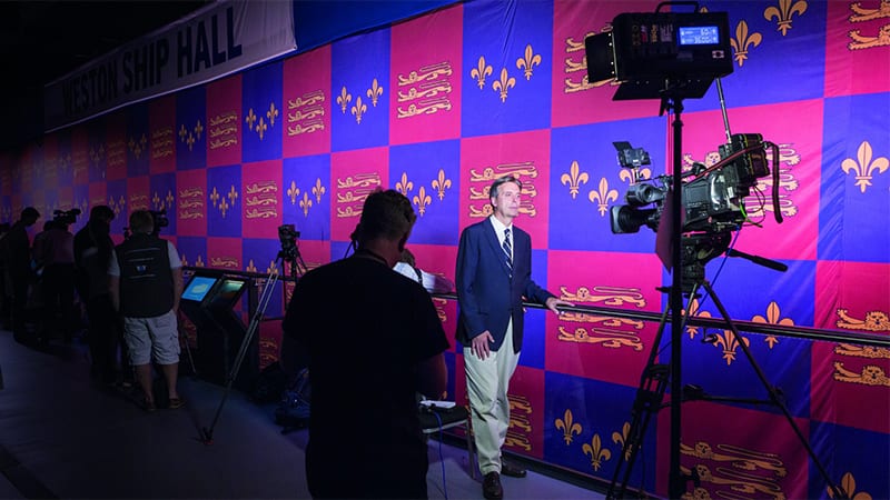
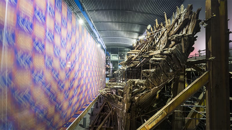
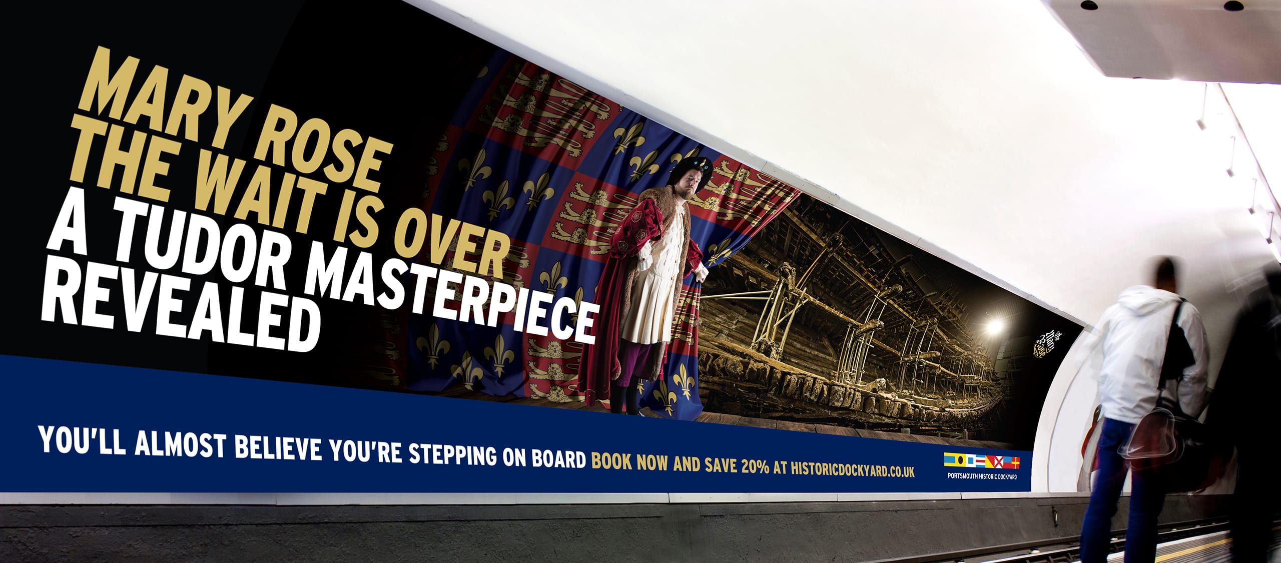
Mary Rose
The Reveals
- Event Management
- CGI
- Advertising

BRIEF
The whole world was waiting for the moment that Henry VIII’s favourite warship, The Mary Rose, would come to life in a way not seen since it sank in battle nearly 500 years ago. The event needed to be dramatic. But it also had to pay tribute to the lives of its crew and to the epic efforts of the many people who had worked towards making this dream a reality over decades. Following our previous hugely successful reveal of The Mary Rose Museum, a £5.4m revamp had seen it transformed; its interior walls replaced by nine floor-to-ceiling glass-panelled galleries, giving visitors stunning panoramic views of Henry VIII’s flagship. Now was the time to reveal it to the world.
ACTION
Our concept, ‘Masterpiece Revealed’, was designed to create maximum intrigue and to link with our reveal (watched by 1 billion people) in 2013 of the ship’s home, The Mary Rose Museum, when a giant Tudor flag draped its exterior façade. For this event, working with a specialist stagecraft company, a Kabuki drop of a 41 m wide x 15 m high Tudor standard fell away to reveal the ship for the first time. A promotional campaign was seen on the London Underground in 48 sheets, on outdoor across the south east and an online campaign.
RESULTS
“We are delighted to confirm that the resulting media coverage has not just matched the scale of the 2013 coverage, but has exceeded it by 50% at 1.5 billion reach to date."
Helen Bonser-Wilton, Chief Executive, Mary Rose Trust.“What a fantastic event, and thank you so much for making it all happen. From the creative planning to the execution of the event, it has been fantastic.”
Jane Hodgkins, Head of Marketing and Communications, Portsmouth Historic DockyardPR
Reach1.5 Billion
World's
LargestTudor Standard

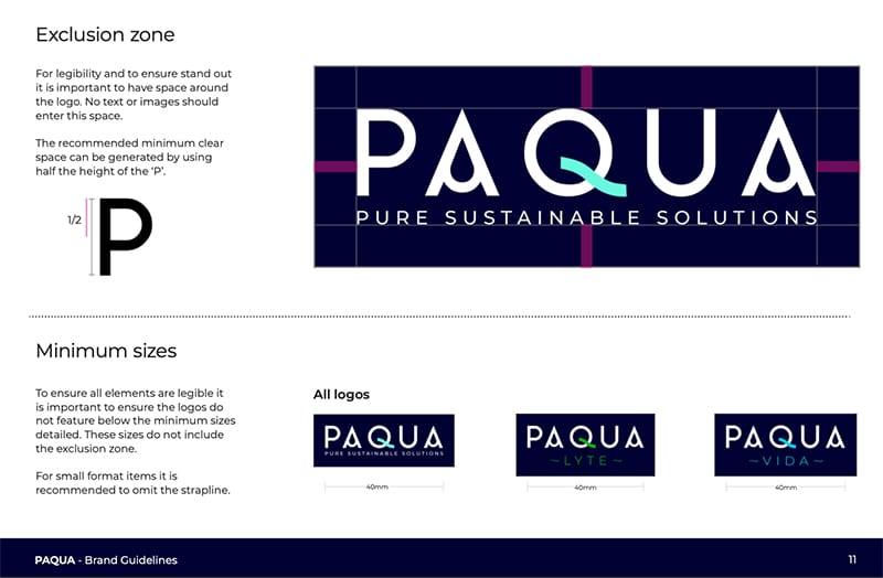
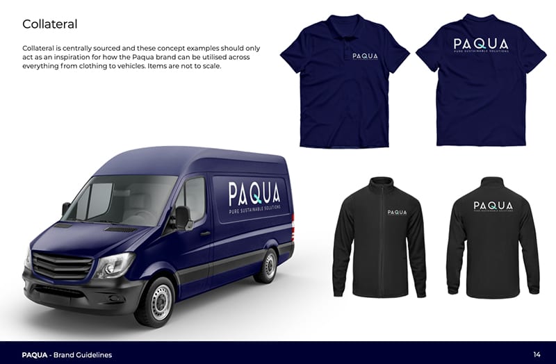
Paqua
Brand Creation / Launch
- Branding
- Marketing
- Web Development
- Social Media
BRIEF
Paqua, formerly known as Portsmouth Aqua, are a unique water purification company, successfully creating sustainable water purification systems without harsh chemicals that run on low power. After successful trials of their cutting-edge system, they recognised their potential to be leaders in the global market and wanted to ensure that they had stand out. Our brief was a full rebrand, including new name, strapline, website, visual identity and brand values, reflecting their potential to be leaders in the sustainable water purification market.
ACTION
We worked closely with Portsmouth Aqua to understand their product and their values. We also conducted research and set up social listening to determine their target audience. Using all of this, we launched the new brand, Paqua, a name that retains the Portsmouth roots of the brand while driving the global relevance of the product. We also created a new logo, strapline and brand guidelines, and used these to build a new website and establish Paqua on social media.
RESULTS
Within the first month of the rebranding launch, Paqua experienced a 5000% increase in audience growth on Facebook and a 66% increase in engagement on LinkedIn. They also saw the overall average engagement time on their website increase by 42% in the first month, and new website users increase by 35% in the second month. Paqua have now attended their first trade show as their new brand, with excellent reception as they move from strength to strength.
Facebook
5000%
LinkedIn
66%
Twitter
300%

Royal Maritime Hotel
Digital Guestbook
- Branding
- Digital Conternt Management
- Consumer App
- Art Direction


BRIEF
Born out of the effect Covid had on the hospitality industry and today’s continuing focus on contact hygiene, the Royal Maritime Hotel & Club wanted to replace the physical guestbooks in each of the rooms with an online version accessible by scanning a QR code on smartphone, tablet or laptop.
ACTION
We developed a cost-effective white label stand-alone digital guestbook product that can be branded as required. Intuitive and user-friendly, it streamlines the entire guest journey, from pre-stay, to in-stay and post-stay. With integrated QR code, this is an easy and attractive way of staying in communication with guests. It allows for customising pre-arrival emails and SMS flow, quick digital check-in, segmenting upselling offers and upgrades, and information such as current menus, spa opening times, special offers, along with tools to help diversify revenue streams such as connecting guests to local service providers. Post-stay, opportunities for personalised guest surveys, dashboard and NPS score increase brand awareness by encouraging guests to sign up to regular offers.


RESULTS
Massively reduced operational and time costs for the client, this powerful scalable platform is serving to boost direct booking revenue and give superior customer service while providing opportunities to maximise guests’ average spend through upselling extras directly to their own phones and laptops. What’s more, it’s sustainable – no more dusty old folders and directories in rooms or paper wasted on restaurant menus and flyers.